
MiVoice Office Application Suite - Technical Manual
Real-Time Dashboard Quick Reference Guide
The following guide is designed to provide an introduction to the core features of the Real-Time Dashboard.
The webpage provides real-time visibility of calls, do-not-disturb status* and agent status* on the telephone system. By default, a standard view containing some commonly used statistics are added on first logon to the dashboard. This view can then be customized with a variety of tiles which can be filtered as required. The dashboard provides the following types:
* Agent & DND visibility require additional licensing.
A Dashboard can have multiple views configured by the user, they can then switch between the views via the dropdown box.
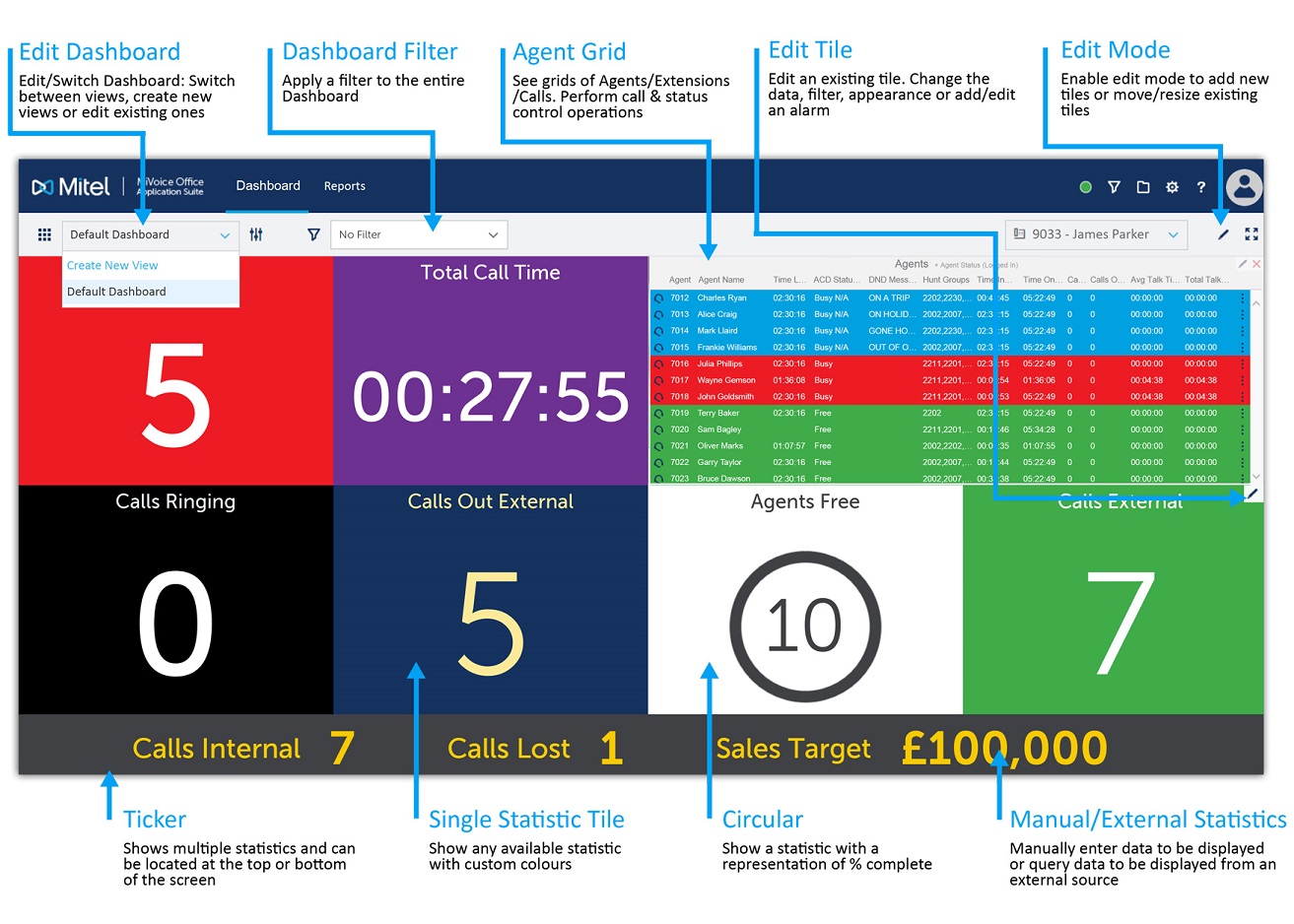
Choose a single statistic from the call, DND & agent field options. The foreground & background colors of the tiles will be selected randomly by the wallboard (dependant on the default option chosen) but can be changed as required. Optionally, the appearance of a single statistic tile can be changed to show a circular gauge displaying the % of a target value.
These tiles display similar information as single statistics tiles but can display multiple statistics at once, or cycle through multiple statistics. Each statistic added can have a different appearance to help distinguish between them.
These tiles can display images, live streaming video from live feeds or display an uploaded video file on a loop. Audio from videos can be turned on or off.
The ticker can be used to show up to 20 different statistics that loop round the screen. As with the multi-statistic tiles, each statistic added to the ticker can be given a different appearance to help distinguish between them.
Grid tiles provide real-time information about specific devices/calls rather than system wide. Grids are provided for agents, calls, extensions & trunks. In addition to summarized and current status information, grids provide third party control over other calls/device. Change an agent's ACD or DND status or move/steal telephone calls. To access the call/status control menu, left-click on the status icon at the far left of a row or the more icon ( ) at the far right.
The full screen mode can be toggled* using the icon provided. When enabled, the browser frame/toolbar and the website title bar are removed so that the the dashboard fills as much of the screen as possible.
* Full Screen mode is not supported in all browsers
If required, manually added data (Global Variables) or data from external databases can be displayed on any of the tiles. This is useful for displaying general information to users such as sales targets, promotions, support information etc.
 ) of the website. This will only be available with the correct permissions.
The following guide is designed to provide an introduction to the core features of the Real-Time Dashboard.
The dashboard provides real-time visibility of calls, extensions* and agents* on the telephone system. Each user can customize multiple views with a variety of tiles which can be filtered as required.
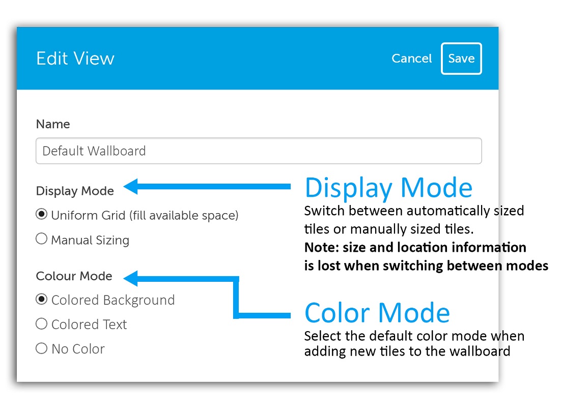
The display mode can be set to either 'Uniform Grid' (default) or 'Manual Sizing'. When uniform grid is enabled, the tiles on the wallboard will automatically resize as tiles are added or removed, simplifying the setup of the wallboard. When manual sizing is enabled, each tile must be individually located and sized. The benefit of manual sizing is that tiles can be different sizes if required.
The color mode can be set to either 'Colored Background' (default), 'Colored Text' or 'No Color' (black and white). When colored background is selected, each new tile added will be given a randomly selected background color with white text (recommended for viewing from a distance). When colored text is selected, each new tile added is given a randomly selected foreground color with a white background (recommended for viewing close up). When 'No Color' is selected, each new tile added is given a white background with black text.
To add new tiles or move/resize existing tiles, edit mode must be enabled. Press the edit ( ) icon on the top right-hand side of the view to enter edit mode. Once enabled the plus (
 ) icon can be used to add new tiles to the view. When pressed, the 'Add Tile' form is displayed, providing a choice between the different types of tiles available. Additionally, while in edit mode any existing tiles can be moved or resized (when using manual display mode). Press the tick (
 ) icon to exit edit mode.
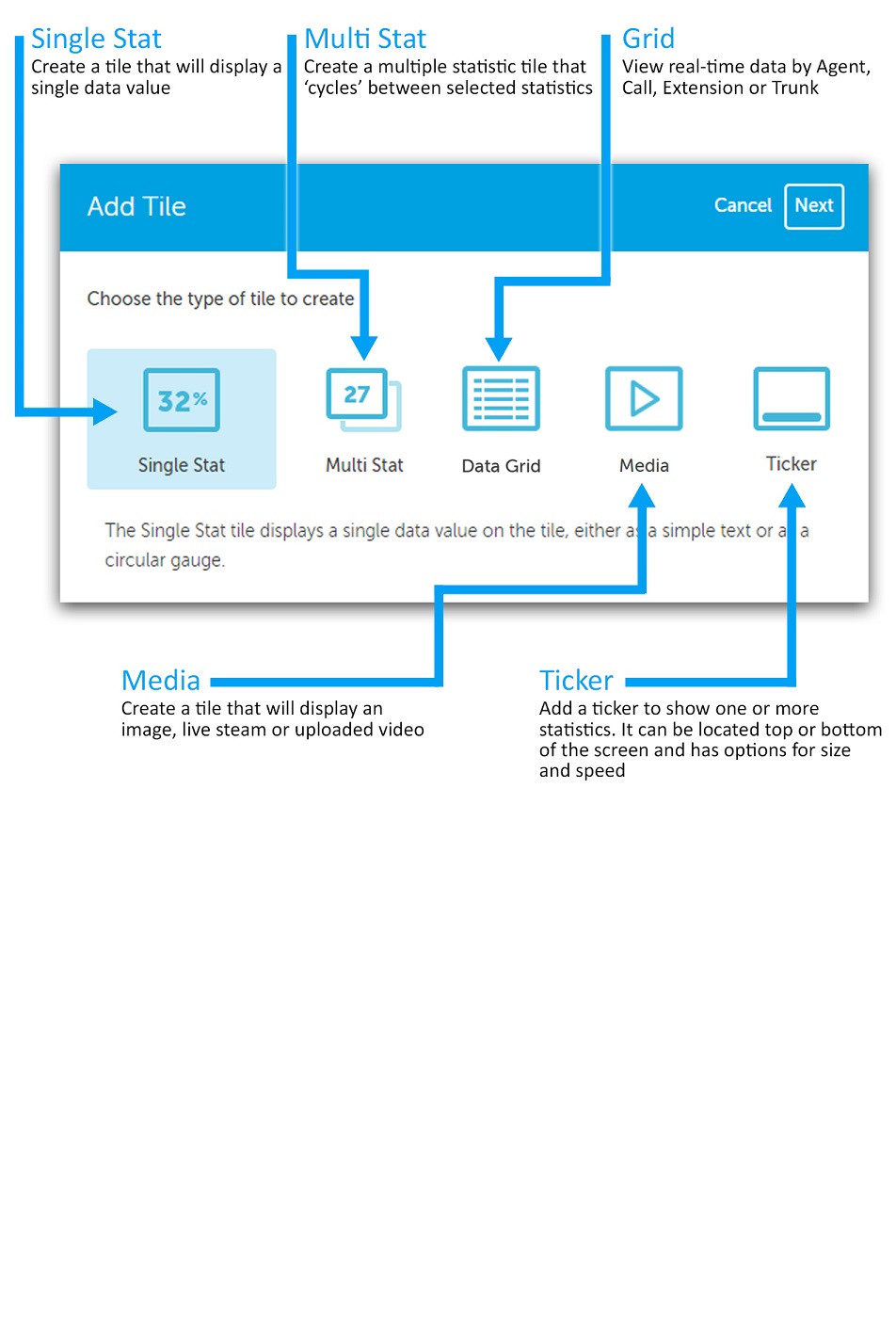
Once the tile type has been selected, press the 'Next' button to view the tile properties form.
Each tile has a set of properties so that it can be customized. The properties available will differ depending on the type of tile being edited/added. The image below shows the property form based on a single statistic tile.
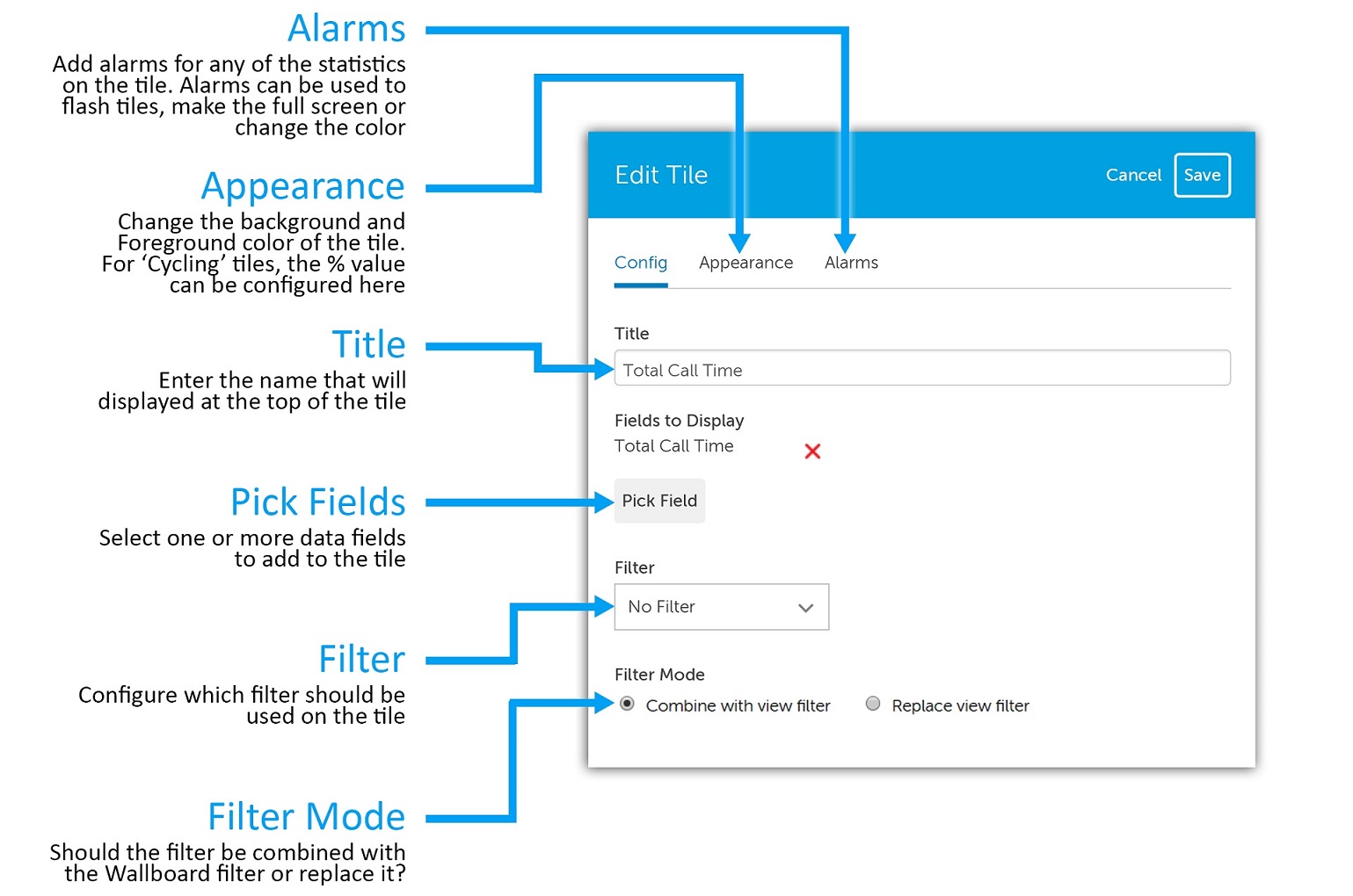
The title will be displayed at the top of the tile. By default, this will be set to the name of the data field selected, but can be changed. To add fields to a tile, press the 'Pick Field' button and then select the required field from the context menu. To aid selection, the fields have be grouped together into categories.
The data on each tile can be filtered if required. By default no filter is applied. The filter mode is used to select whether the overall Wallboard view filter is applied or not. When set to 'Combined with view filter' (default), any filter set on the Wallboard view will be combined with any filter set on the tile. If set to 'Replace view filter' any filter set on the Wallboard view will be ignored.
The appearance section provides access to change the foreground/background color of the tile and also any other display options (such as 'Circular Gauge').
Each tile can have one or more alarms configured. Alarms can be used to bring attention to tiles when thresholds are reached or breached. Alarms can be set to do the following:
Overriding a tile's foreground and/or background color is very useful for creating traffic light style tiles. For example, thresholds can be set to change a tiles color from green to amber to red based on the data field's value. This can be used to help bring attention to specific performance targets.
The title bar provides access to areas of the App Suite. The image below outlines each of the navigation icons:
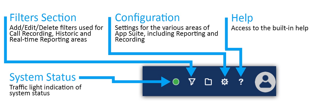
The configuration section and system status will only be visible with the correct permissions.
The 'Filters' section of the website is used to manage all the saved filters on the system. Filters can be used with reports or recordings.
Each user has their own 'My Filters' section that provides a list of all filters they have created.
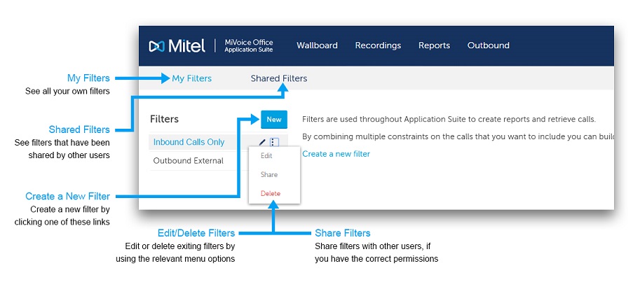
Filters can be shared between users to avoid duplicating work and to allow administrative staff to set up filters that can be used by everyone.
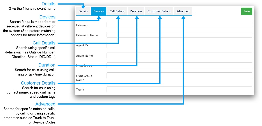
Each filter provides the ability to search on one or more details about a call. The details are grouped into tabs. The tabs are displayed with descriptions in the image below:
The use of special characters within the text boxes for a Filter enables the use of complex filter strings.
The following characters are supported:
| Special Characters | Description |
|---|---|
| Exclamation mark (!) | Not equal to |
| Percent (%) | Fuzzy matching (equivalent to a SQL LIKE %) |
| Underscore (_) | Fuzzy matching of a single character |
| Comma (,) | Can be used to search for multiple values at the same time |
In addition to the special characters above, the following characters are supported when searching using a device based field (Extension, Agent, Trunk, Hunt Group):
| Special Characters | Description |
|---|---|
| Plus sign (+) | Greater than or equal (e.g. 1000+ for extensions greater than or equal to 1000) |
| Hyphen (-) |
Delimits a range of values to match (e.g. 1000-2000 for all extensions between 1000 and 2000 inclusive) |
The example below shows what would be matched when entering combining multiple special characters using a comma:
Matching endpoints: 1000, 1001, 1002, 1004, 1005, 1040, any that start with 18 and end with a 5, any with a value greater or equal to 2000.